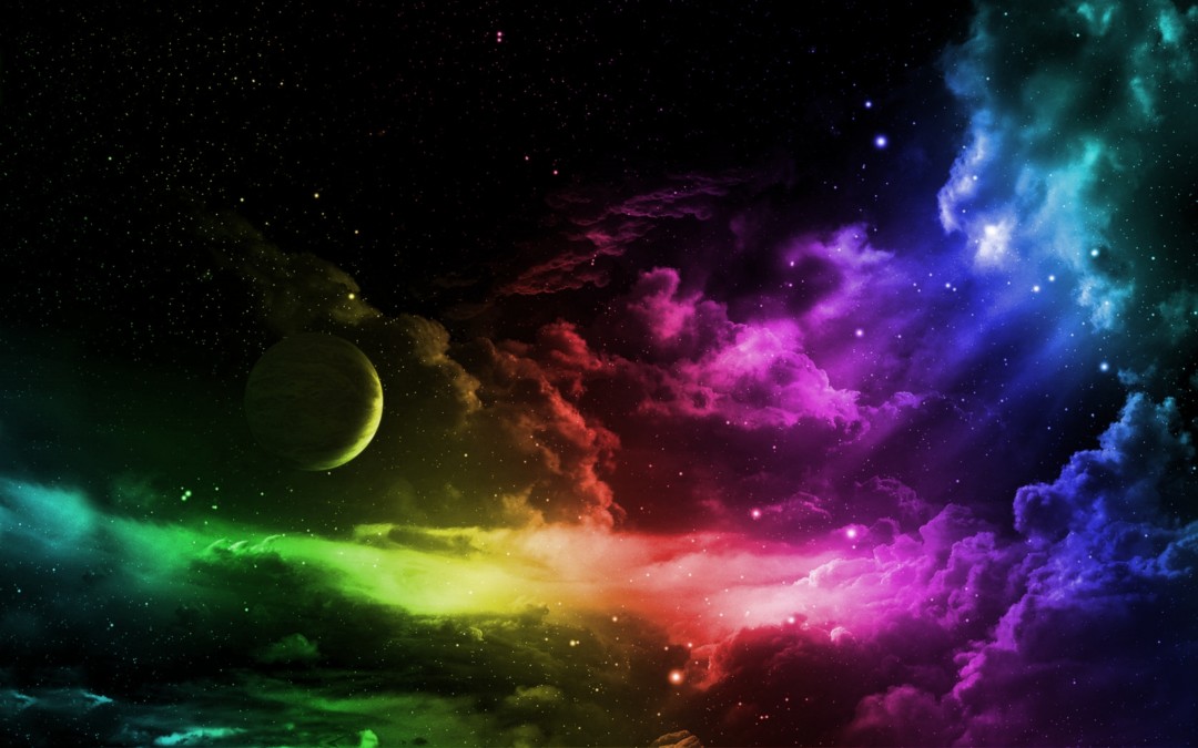


The importance of color
Color is one of the most impactful stimuli in our environment. Did you realize it can be used in various ways to manipulate your emotions and behavior? On PsychologyToday.com Douglas Van Praet writes,
Why would anyone brush with toothpaste clinically proven to whiten teeth and then rinse with a brightly colored green mouthwash containing blue dye #1 and yellow dye #5? …our unconscious minds have learned to associate the color green with the feeling of clean, fresh, and minty. So much so that now every time we see the color green, it comes with a powerful emotional affect, overriding any concerns about why we are buying whitening toothpaste in the first place…
…If you want to improve your buying decisions you have to become aware of your unconscious associations. By relearning a new association, such as colorless mouthwash means cleaner whiter teeth, you can create better and more rational choices.
Color and behavior manipulation
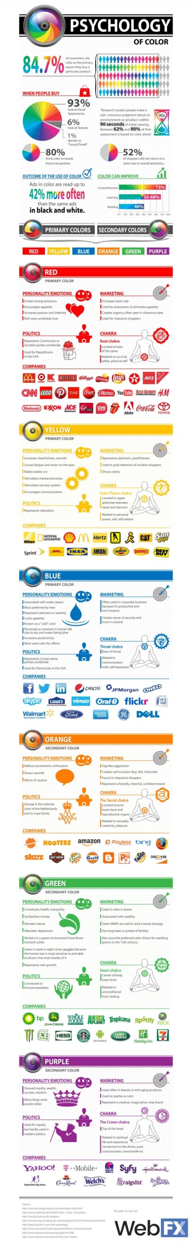
Companies are very particular about the colors they choose for their branding, because various hues evoke responses within us. They use this understanding about human psychology, and seek to create environments and dispositions to essentially disrupt consumers’ ability to make rational decisions. Manipulating our levels of stress is key to this. Every successful brand does this, and you can learn more about how they achieve it.
Even I have made a specific study of the psychology of color. I very purposefully assembled a palette of blues, purples, and greens. Most personal trainers opt for reds, oranges, and yellows, because they want you to feel energized and motivated. They want you to leap at the opportunity to work with them. That is very logical, and totally sensible. I wanted to create a sense of trust, inspiration, and health.
I am looking to work with people who are more motivated by creating a personal relationship with me based on trust, inspiration, and health. It’s my goal to work with people over the course of a long time, and to help them make permanent adjustments to their lifestyles. I am definitely not trying to manipulate people into making spontaneous or irrational choices based on over-agitated impulses.
Chakra Alignment Therapy
The chakras are a system of energy focal points. They tend to correspond with nerve bundles throughout the body, and they influence your wellness. When you experience balance in your physical, psychological, and emotional selves, your chakras are said to be aligned. If you have symptoms of illness, confusion, or depression, they are not.
Given that we know how powerfully color affects our psychological state, it’s important to understand how to use all this to our advantage. Interior designers, fashion mavens, lighting specialists, and visual artists are readily able to use color, and you should too. If you have ever watched decorating shows, you will be familiar with the idea of creating spaces that foster moods.
Even if you can’t afford a full make over with a professional, you can make adjustments on your own within your various spaces. If you cannot repaint or reupholster, you can still place items and pictures strategically. You can choose to wear clothes, makeup, and/or jewelry that bolster you.
Lighting and mood
Another important consideration is light itself. It should be fairly obvious that the color and luminance of a light source changes everything about the mood of a space. Bright sunshiny afternoons versus cloudy or foggy mornings? The long days of summer versus long winter nights? How do these tend to make people feel? (As two side note: 1) If your sleep suffers, consider using yellow tinted lenses to block the blue light that stops the production of melatonin; 2) if you feel depressed during times of limited sunlight and get Seasonal Affective Disorder, consider using full spectrum lightbulbs.)
Restaurants dim lights at dinner time. Stores use brightly lit stores to show off the colors of their products. Jewelers place LEDs around their gems to make them sparkle brilliantly.
Why do they do this? What kind of lighting surrounds you? Windows, curtains, bulbs, stained glass: All these affect the way you will feel in a room. How have you implemented them in the rooms in your home? Perhaps a more specific question is, “How do you want to feel, and are the colors and light sources around you helping you achieve that?”
Adding and subtracting
Not every complaint requires that you add a color. Quite the opposite: Many situations can stem from an overabundance of a particular hue. Are you feeling angry, agitated, or aggressive? Consider whether you are surrounded by too much red. Are you wearing it often? Has it been your favorite color for just about everything?
When to add
- Red should be included if you are feeling scared or unstable. Red is aligned with the base chakra, and it corresponds to our need to feel safe.
- Orange helps offset lethargy and procrastination. If you have lost your sense of creativity or sensuality, consider adding some orange back into your life. It also helps to generally pep up your energy and emotions.
- Yellow is another energizing color, but this one is more attuned to your sense of self, will, and connection to others. If you have trouble feeling confident, yellow can help. It’s also good to include when you’re uncomfortable socializing, or when you doubt who you are and what you want.
- Green is the color associated with various types of love. Not just romantic love either. Try bringing in some green if you’re feeling hatred or apathy.
- Turquoise represents Vishuddha, the throat chakra. It controls communication, so add light blue to your palette if you feel you cannot express yourself. When you sense that your intentions aren’t clear, look to this color. It can also help with stage fright, so keep that in mind the next time you have to give a presentation or performance.
- Blue connects to perception, intuition, and inspiration. If you feel disconnected from your surroundings, or unable to understand what others do or say, it might be time to bring more blue into your life. Out of ideas? Look to blue.
- Purple should be added when you’ve lost your sense of purpose. This is a very spiritual color, and it vibrates in a place that’s more ethereal. This is the color of wisdom and transcendence, so make sure you keep it near when you’ve lost your way.
When to subtract
- Red is not the color for you when you’re in a bad mood. It’s very stimulating, and if you’re angry or fitful, red can put you over the edge most of all.
- Orange is connected to creativity and sensuality, and it’s highly energizing. If your racing thoughts and ideas overwhelm and distract you, keep the orange to a minimum. Overly passionate or amorous? Mhm.
- Yellow is exciting, but it can also be overwhelming. If you find yourself being willful or stubborn, you might want to cool it down a bit. If you notice you’re dominating conversations or running over people in social settings, better make sure you aren’t exposing yourself to too much yellow.
- Green symbolizes compassion, love, and integration. When your heart chakra (Anahata) is balanced, you have healthy relationships and emotional connections to people. However, if you tend to be codependent, obsessive, jealous, clingy, or desperate, it won’t be helpful to keep green around.
- Turquoise goes along with communication; however, you can express too much. Are you sharing too much information? Are you nervous in silence? If you have to constantly fill the air with words, or if you find yourself lying or exaggerating, avoid this color.
- Blue is a cooling color. Sometimes too cooling. If you are frigid, judgmental, sad, or depressed, check to make sure you don’t have lots of blue in your life.
- Purple is transcendent, and having a sense of purpose and the divine is critical to wellness. However, if you are flighty to the point of constant distraction, or you completely disconnect from your obligations to yourself and others, reduce or eliminate purple until you reconnect.
Questionnaire
New Clients: Please submit your health history prior to our first appointment- Be thorough and specific
- Feel free to ask questions
- Submit 24 hrs. before Evaluation
Evaluation
Onboarding Clients: Please be dressed to move on an open and level floor- Bring water, SPF, hat, towel, etc.
- Purchase subscription within 30 days:
- Get $100 credit = FREE Evaluation!
Coaching
Current Clients: Select subscription and start saving!- Bring water, SPF, hat, towel, etc.
- If you journal, please share it
- Early Cancellation = +24 hours
Recent Posts
Glycemic Index vs Glycemic Load
This score indicates how damaging a food will be to your blood sugar levels. Foods that score 0-55 are rated low impact (and thus presumed to be better for diabetics and those looking to maintain healthy weight and/or body fat ratios), but this is not the whole picture.
Caffeine: 14 better options to ease SAD
Nearly a year ago to the dot, I wrote an article about Seasonal Affective Disorder (SAD), but there I focused on the importance of getting access to a full range spectrum of light. Here I’d like to focus on caffeine and sleep’s effect on SAD. I’ll also offer suggestions for what to do to help you feel better on the dark days.
Avoid fish oil supplements
I don’t generally promote supplements. Most of them play to specific, isolated points of medical research to serve as a magic pill. One remarkable example of this is fish oil.